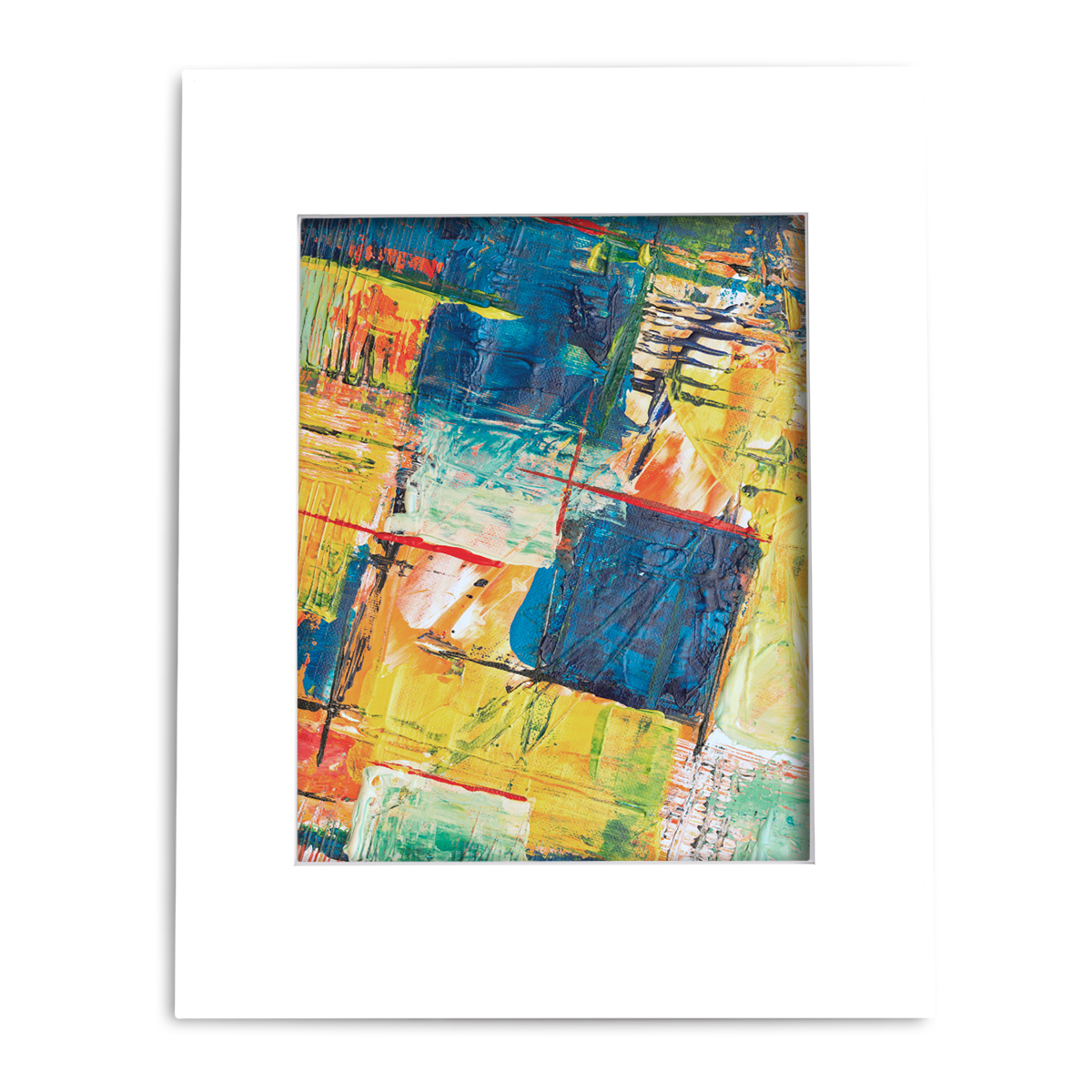
Selecting Mat Board Color—A Comprehensive Guide
Take it from us. Picking your mat board colors is really fun.
You’re able to express your creativity, find color combinations that’ll make your art jump off the wall, and when you finally see it all come together, the final product can’t help but put a smile on your face.
It is a great feeling.
But with so many colors to choose from, it can be confusing to figure out what you want.
Which is why we put together this guide to help you get started. Here are some guidelines that can help you choose a matting color.
(To see how your artworks look like with different mat board colors, try our custom mat board builder)
Contents
Black and White Mats
Black and white mats are the most commonly used mat boards. They provide a simple, professional finish for your artwork.
If you are planning to sell your artwork, black, white, or variations of black and white are the way to go (most of the time). The reason for this is because these colors are the easiest to match with decor and frame choices.
White and black makes it easy for customers to imagine the artwork in their own home and the sale that much easier.
White + Variations of White

(White Economy #NS501)
Link: 11X14 ECONOMY PRE-CUT MAT BOARD
White mats and variations of white (off-white, ivory, ivory turret) are the most commonly used mat boards—for good reason.
White pretty much goes with anything.
It won’t be the best choice in every situation. But without knowing where the artwork is going to be hung or what frame is going to be used, white is always a safe solution.
There is some yellow tape that comes with white mats however.
Be careful with white mat boards when you’re matting artworks with:
- Soft colors (pastels, chalk, etc)
- “Muddy whites” or whites that aren’t as bright
A bright white mat board in these cases will overpower the artwork, diverting attention away from it.
In these cases, variations or shades of white (grey, off-white, ivory, ivory turret) will be a much better solution.
(White Economy #NS501, Light Grey Economy #NS120, Off-White Economy NS502)
That brings us to our next topic:
When to go with grey and when to go with off-white?
Dark vs Light/ Highlights vs Shadows
To illustrate the difference, here’s a comparison of an off-white mat board and a black mat board.
(Off-White Economy NS502, Black Economy NS142)
A pure white mat board would be too strong here. But even with the off-white mat board, the highlights don’t look as strong as they should.
The black mat board, on the other hand, really helps the highlights shine here.
So, for when you’d like to accentuate your highlights, go with a darker shade.
For shadows, do the opposite.
Take a look at this comparison for example.
(White Economy #NS501, Black Economy #NS142)
The shadows on the right just don’t carry the “oomph” that they should. The black mat is too dark and overpowers the shadows.
Whereas when matted with the white mat board, the shadows look fine.
So for times you’d like your shadows to pop, go with the lighter tint.
Matting Black and White Photos
The same logic applies for black and white prints as well. When matting your b&w prints, mat with the lesser of the two colors.
(Black Economy #NS142)
(White Economy #NS501)
Increasing Depth with Black Mat Boards
One caveat with black mats or mat boards of a darker shade is that they increase depth. They pull the eye in.
(Off-White Economy #NS502, Black Economy #NS142)
For artworks that feature a lot of depth, this can really make it pop.
Dominant Color
Matting with a dominant color from your artwork is also very common.
The mat board will blend in seamlessly, making this great for accentuating elements that don’t share the same color.
PS. It doesn’t have to be the same exact color. Just choose something that is close enough, monochromatic or analogous colors work fine.
The contrast is beautiful when done right.
(Dynamic Blue Economy #NS138)
(Dignity Blue Economy #NS141)
Complementary + Split Complementary Colors
Some color theory does wonders when putting your artwork up on your walls.
For a bold, striking look, try pairing your artwork with a complementary color.
Complementary colors are colors that are directly opposite on the color wheel. When paired together, the strong visual contrast is both striking and dynamic.
(Bottle Blue Crescent #BW334, Dignity Blue Economy #NS141, Dynamic Blue NS#138)
(Maroon Economy #NS124)
If complementary colors are too bold, try split-complementary colors for something more soothing but still visually interesting.
Split-complementary colors are colors that are analogous or next to the complementary color.
(Bottle Blue Crescent #BW334)
(Old Gold Economy #NS143)
To discover complementary or split-complementary colors, https://www.colorhexa.com/ is a great resource that’ll give you exactly what you need. Just type in the color you’d like to match with, and the website will feed you the colors you’re looking for.
When to Use Double Mat
What is a double mat?
A double mat is when a top mat board is layered over a bottom accent mat.
By double matting, you can introduce a splash of color to your matting selection, create more depth, offset the brightness of a white mat or the darkness of a black mat, and draw more attention to your subject.
Here’s how you accomplish that.
B&W/W&B
If you’d like to mat with a black mat without weakening your shadows or if you’d like to mat with a white mat without weakening your highlights, you can do so by double matting.
(Off-White Economy #NS502, Black Economy #NS142)
Another Level of Depth
By double matting, you can introduce another layer of depth to your project.
You can use this to enhance the depth that is already there or to give some depth to artwork that is flatter.
(White Economy #NS501)
Drawing Attention to Your Subject
(Top Mat—Light Grey Economy #NS120,
Bottom Mat—Deep Blue Economy #NS222)
Compare the two examples here.
You’ll find the eye is more focused on the ferris wheel in the second example.
The blue mat helps the eye settle in where you’d like the eye to settle. By bottom matting with the color of the subject, the eye darts to your subject and remains there.
However, if you were to mat with only the blue color, the mat board will be too dominant taking attention away from the artwork. Because the subject is smaller, a hint of blue is all you need to bring it out.
For Splashes of Color
Sometimes top matting with a bold color is too much. Maybe it will clash with your decor. Maybe it will clash with your frame. Maybe you’d just like to tone it down.
By double matting, you can still introduce some color without it being overpowering.
The same guidelines still apply so we’ll just demonstrate how complementary and split-complementary colors look when double matted.
Complimentary Colors
(Top Mat—Silver Crescent #BW472,
Bottom Mat—Bottle Blue Crescent #BW334, Dignity Blue Economy #NS141, Dynamic Blue NS#138)
(Top Mat—Light Grey Economy NS120,
Bottom Mat—Maroon Economy #NS124)
Split-Complementary Colors
(Top Mat—Ivory Turret Economy #NS104,
Bottom Mat—Bottle Blue Crescent #BW334)
(Top Mat—Off-White Economy #NS502,
Bottom Mat—Old Gold Economy #NS143)
Black Core
Black core mat boards are mat boards that have been dyed black on the inside. When cut, the beveled edge will show black instead of white or cream.
The black isn’t nearly as dark as a black mat board and the reveal is much less than double matting. What you get instead is just a hint of black.
This is a great way to add a cinematic flair to your finish.
8-ply
8-ply mat boards are twice as thick as regular mat boards. The extra thickness of 8-ply mat boards can help create depth and a sense of drama.
This heightens the “importance” of the artwork and looks great with portraits or other serious artworks.
Wrap Up
Each artwork is unique and will have its own color palette that works well with it.
But as a starting point, these guidelines will point you in the right direction.
White Mats
- Great in almost every situation
- Use a variation (off-white, ivory, ivory turret, etc) when pure white is brighter than your highlights
- If you’re hanging a show, go with white or an off-white
- Looks great when paired with black dominant B&W artworks
Black Mats
- Great for accentuating highlights
- Can diminish the shadows in your artwork
- Looks great when paired with white dominant B&W artworks
- For artworks that feature a lot of depth, black mat boards help it jump off the page
Dominant Color Mats
- Matting with the dominant color of your artwork allows the mat board to blend in
- If the color appears in the foreground, the background is accentuated and vice-versa
- Can be analogous or monochromatic colors. Close is good enough
Complementary + Split-Complementary Colors Mats
- Bold and striking. For something more soothing, try a split-complementary color for your mat color
- https://www.colorhexa.com/ is a great resource to discover these colors
When to Double Mat
- B&W
- Offset the brightness of a white mat by bottom matting with a black mat
- Offset the darkness of a black mat by bottom matting with a white mat
- Another level of depth
- Draw attention to your small subject by bottom matting with its color
- For splashes of color (complementary and split-complementary colors also work well here)
Black Core Mat Boards
- Adds a cinematic element to your artwork
8-ply
- Dramatic finish, great for portraits or “serious” artworks
If you’d like to preview your artwork with mat board colors, play around with our custom mat builder to find the best mat board for you.
Recent Posts
-
Exclusive Picture Frame Clearance Event!
Dear Valued Customer, We hope this email finds you well. At Mat Board Center, we're excited to …Aug 09 2023 -
Elements of Art—Color
7 elements of art. Each an essential tool in your art arsenal. We’ll be diving deep into each ele …Mar 11 2020 -
How to Sell Art on Etsy: A Step-By-Step Guide to Setting Up Your Store
Getting started selling your art? Etsy is a great place to get your feet wet. It’s:Easy to get start …Sep 26 2019


